Saturday, December 15, 2012

Vintage Pens Giveaway

I never stop collecting items associated with the history of books and writing, both for my own pleasure and to share at workshops and presentations. Recently I discovered two vintage boxes of William Mitchell's Pens in a local shop. As you can see, the top of the box is embossed and inside there are twelve nibs and a handle. I hope someone will tell me their likely production date.

So, as a token of thanks to all writing and calligraphy friends, cyberscribes, blog and website visitors, schools at which I have conducted workshops, people who I have interested... I'll give one of these boxes away (99% pristine - a small fragment of the lid's side needs reattaching). Just add a comment to go into the draw. I hope you'll also consider following this blog.


To save getting the parcel lost in the seasonal mail, I'll make the draw on Jan 1st.

I also have another promotion - this time, in association with my latest book, 'Calligraphy for Greetings Cards and Scrapbooking'.

It has an enormous amount in it to teach calligraphy skills and using them for any purpose. It's for adults and older children and covers tools and equipment, alphabets, spacing letters and words, layout and design, creative letters (cut, decorated, embossed, pop-up and more), trails and borders, mass producing and printing cards and invitations, envelope design... and there's a gallery section of inspirational work by a variety of craftspeople. It's been beautifully designed and printed.by the publisher, GMC Publications.

It's available or able to be ordered from all bricks and mortar bookstores and online retailers worldwide.

As reviews help to sell books and I’m dependent on royalties, which won’t be payable until about 2,000 more copies are sold (mid- to end 2013??), I’m doing a promotion. If anyone who visits here, or any of your friends or blog readers chooses to buy a copy, after they have added a review on the retailer’s website or in a Guild/Society/industry newsletter, teacher's or librarians' journal/newsletter or similar, I will calligraph and decorate a name of their choice and snail mail it (they email me the details to Peter (at) writing-for-children.com). I’ll keep this offer open until I have 10 reviews on each website, and one in each of a large number of relevant journals and newsletters.

Enjoy celebrating your seasonal festivities and wishing you Peace, Love and Joy throughout 2013 and every year,

Peter Taylor
Writing for Children
www.writing-for-children.com
www.ptcalligraphy.com


,


Tuesday, December 04, 2012

Eggs, Eggs and a Border Design

There are noticeable differences between eggs from factory-farmed caged hens and from those kept in back yards and fed food scraps and allowed to forage and eat worms and insects. It surprised me to learn that medieval scribes and manuscript illuminators, who used egg yolk and egg white to help make gold and colours stick to the page, also had a preference for eggs from country hens for some purposes, and from town hens for other requirements.

Today I'm working on a border design to hopefully gain an editor's interest in a project. The boxes at the bottom still have to be completed. The design is a 'modernised hybrid of The Luttrell Psalter and the Macclesfield Psalter', and chosen to accompany a story set in the 14th century.

If I use 23ct gold, the finished work will look wonderful - but could it be satisfactorily photographed or scanned and reproduced in a children's book? Would its use impress or deter a publisher? Hmmm. I've been putting off that decision for a while. Maybe I'll have to do two versions...

Have fun being creative

Peter Taylor
www.writing-for-children.com 

Sunday, November 25, 2012

Unforgettable - but not now

Here's Stonehenge without a fence or sanitized path. You could touch the stones, lie on the altar slab and imagine all kinds of things in 1959. What an unforgettable experience!


I took these photos with the latest design Kodak Brownie 127, a 10th birthday present. 

Have you taken photos from viewpoints that are now forbidden? I often wonder if we really need to protect so many sites from visitor interaction. I'm told they have also fenced off areas in Carnarvon Gorge in Queensland where I once sat and let my imagination run wild. 


I mean, in these days when celebs can be photographed from five miles away, it can't be that hard to unobtrusively monitor to make sure people don't do something regrettable.

When I make school visits to talk about 'The History of Books', students can handle a Mesopotamian sales docket from 1800BC...


read Gregorian chant from a page written in 1280...


unwrap a land document written on vellum, complete with King George III's wax seal...


and handle many other treasures.

Are the risks of something being damaged worth taking? Absolutely!


'Peter's workshop was, without a doubt, the highlight of our library year!'
Ormiston College, August 2012 

Many thanks to staff and students!

All children and adults need rich experiences to savour.

Peter Taylor


Sunday, October 07, 2012

History of Books and Illustration

These illustrations were engraved in the late 1700's and published in 1795 to enlighten a population intrigued by new discoveries. It was a pity that the artist had not actually seen the subjects! There was no colour printing in those days, so the pages have been hand-painted, probably by a family, with members each applying a different colour.

The present spelling is orangutan, but you'll also find orang-utan, orang utan, orangutang, or ourang-outang

A Domesticated Female Orangutan 

 Really? And the background doesn't look much like a rainforest in Borneo or Sumatra - their normal habitat. Nor is carrying off humans an experienced behavior, though the practice is recounted in some folk stories. But they are only stories! I wonder how readers regarded orangutans after seeing these pictures and how long it took before they became aware of the truth and were able to see accurate drawings.


These engravings are in the collection of books and documents that I share with attendees at my 'Hands-on History of Books over 4000 Years' sessions for schools and adults. I hope I may see you at one of them. I'll post pictures of some other treasures in the following weeks, but it won't compare to being able to hold them.


Peter Taylor
Writing for Children


Sunday, September 02, 2012

Bushland Lullaby: The back- story

It is my great pleasure to welcome the exceptionally talented Sally Odgers as she tours with her new and delightful picture book, ‘Bushland Lullaby’, which has been beautifully and warmly illustrated by Lisa Stewart and published by Scholastic Australia for children aged 2-5 years old ...and adult readers.


I’ve known Sally for a number of years in a Yahoo network and from her mega-helpful advice and insights provided through her www.affordablemanuscriptassessments.com services. And then there are, of course her books – but I’m afraid I haven’t read them all, Sally. How many is it now? Nearly 300 titles? For the benefit of my international readers, am I right in thinking that your ‘Jack Russell: Dog Detective’ and ‘Pet Vet’ series, written with your husband, Darrel, have been your most popular recent titles – I believe they’re sold in just about every country?

Thanks, Peter! I'm delighted to be here. And yes - the Jack books have been popular. They're available in audiobook, and also in French Canadian as well as US, Canadian and UK publishers.

I hope 'Bushland Lullaby' is also an international hit as it introduces readers to a wide variety of Australian wildlife, with an appropriate gentle and lyrical verse for each. Congratulations to you, Lisa and all the Scholastic team on its publication. Your words are a delight to read out loud and I know children will just love it.

Yes- Scholastic really pushed the boat out for 'Bushland Lullaby'. It’s a lovely book to handle and the design is a nice mix of charm and artistic flair.

Can you tell us about your writing process, please? Was compiling the list of animals the first stage?

Getting the “feel” of the verse was the first stage. I wrote one stanza and polished that and then thought about other animals to include. I went for a mix of iconic Aussies and the slightly less expected so as to cover both readers who want the familiar and those who like novelty.

Writing in verse is never as easy as one imagines from reading the final version in which all rhymes seem so natural.

Do you have any favourite resources or working methods that you use to find the perfect word for each place?

I was blessed with a talent for rhyme and rhythm. It is my legacy from my parents, who were both musical. Dad, at almost 91, still has a fine bass baritone voice and Mum had a sweet mezzo soprano. Dad can sing natural harmony. My sister can do that, too. I inherited volume and timing from my parents, but missed out on tune and harmony. I have some tone, but not enough. Having a partial talent is disappointing, especially when it’s so strong in the other immediate family members, but I have finally realised I did get the talent after all. I just have a different version of it. Mine is an ear for metrical beat and assonance. As for rhyme, I never insist on perfect rhyme – I’d much rather use assonance or consonance and get just the right image than use something banal just because it was perfect-rhyme. Sometimes I look at a rhyming dictionary though – or a thesaurus- just to make sure I haven’t missed that perfect word.

I’m sure you must have found some stanzas easier to compose than others. How long have you worked on this text? Were there many alternatives that you considered for some lines? Was your editor able to make helpful suggestions?

I wrote a few different versions of some of the stanzas, but this is quite close to the original. My editor worked with me over one line in particular –

This stanza:

On a shivering island clad with snow

Where the ocean kisses icy floes

In a stony nest with her mother close

Little penguin may safely doze.


...was originally like this:


On a shivering island clad with snow

Where the ocean kisses chill ice floes

In a stony nest with her mother close

Little penguin may safely doze.


The main shift though, was in the ordering of the stanzas. I had them quite differently arranged, but Ana, my editor, pointed out that with a bit of re-ordering we could go through a day from dawn to starlight.

All books of mine have been much improved through interaction with the editor and art director.

Everyone in a publishing house will think of this as ‘my book’ – even the printer. And I know Lisa will feel the same way. Did you and Lisa know each other prior to this book? Was it a traditional collaboration in which Scholastic chose Lisa to illustrate it without your input, and no contact between you until its completion?

Lisa and I had no contact before 'Bushland Lullaby'. I was visiting the Scholastic offices a while ago with Darrel (my husband and co-writer of the Jack series) and Ana showed me a lovely book with Lisa’s illustrations and told me she was going to do 'Bushland Lullaby'. I was very happy :-) I didn’t have any contact with her, though, beyond asking for (and getting) her email address so I could tell her how pleased I was.

I hope that you’ll be together at an award ceremony! I know ‘Bushland Lullaby’ will be much enjoyed and treasured - and it’s available right now from ‘all good bookstores’. I wish you enormous sales and every success with it!

We are hoping it will be successful and we’d love to work together again one day.

Please share a website address with us.

My website is at http://www.sallyodgers.com

Lisa can be found at http://www.lisastewart.com.au  If you click on BOOKS you’ll see Bushland Lullaby among her other works.

Thanks so much, Peter! And I'd also like to offer the following prizes in a contest:


Everyone who comments goes in the draw to win one of three PDF e-books.

Please state your preference when commenting:

Writing a Picture Book Text
Finding Farholt
Writing Metrical Verse

'Bushland Lullaby' is published in hardback by Scholastic Australia
ISBN-10:  174283177X
ISBN-13:  9781742831770


Very many thanks, Sally! I always find the back-story to books fascinating.

Peter Taylor
Writing for Children
www.writing-for-children.com

You'll discover more about 'Bushland Lullaby' as Sally visits other blogs:

Spinning Pearls 1/09/2012 http://spinningpearls.blogspot.com


From Hook to Book with Chris Bell 7/09/2012 http://christinemareebell.wordpress.com

Kids' Book Reviews with Tania McCartney 8/09/2012 www.kids-bookreview.com

Reading and Writing with Dale Harcombe 12/09/2012 http://livejournal.com/users/orangedale

School Magazine with Jackie Hosking 18/09/2012 http://jackiehoskingpio.wordpress.com/school-magazine


Sunday, August 19, 2012

How the Book was Created - 'A Year with Marmalade'

It’s a big welcome today to author Alison Reynolds and illustrator Heath McKenzie as they blog tour with their new book, ‘A Year with Marmalade’, published by The Five Mile Press – and to offer you a chance to win a copy.


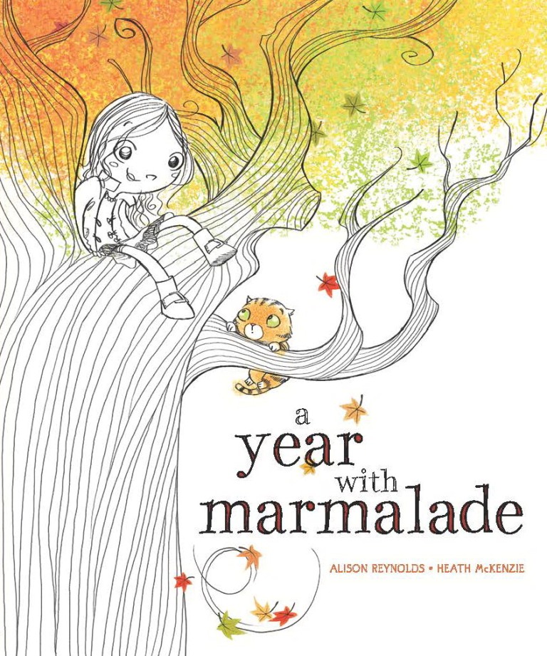
It’s a lovely story of losing friends, making new ones and coping with change – and delightfully illustrated and airily designed with lots of delicious white space. Maddy goes away for a year and asks her friend Ella to look after her cat, Marmalade. But Ella’s and Marmalade’s ideas for enjoyment are different. As the seasons pass... – I won’t give any more away.

I love it, but what age range is it really aimed at?

Alison: Thanks for inviting us Peter. Pre-school/early school years – children 2 – 10 years old.

Everyone will adore it, and I can also imagine that it will be very popular in schools to help teach about the seasons.

I know it will have changed somewhat from conception to publication. Who came up with the brilliant idea for raised and embossed lettering on the cover and the tactile, almost sculpted, tree, and at what stage was the decision made?

Heath: This was purely an in-house design idea – and a very good one at that! (At least as far as I’m aware – I’d happily take credit but alas, it wasn’t my brainwave!)

It’s always a joy to work with publishers and their design and production people who go that little bit further to produce books of outstanding quality that will be forever treasured.

I’ve shown my copy to several friends and they all kept feeling the cover. It really does set the scene so well. And the creative typography is an important element throughout the book, too - graphically depicting stomping, falling leaves and much much more. It adds an extra dimension. Did you envisage all that from the start, Heath? Were the word and line shapes pencilled in detail on your initial storyboard?

Heath: Unlike a lot of other projects I’ve worked on, the text placement was designed before I began illustrating. Or more specifically, I’d done a sample spread (the first autumn leaves image with all the piles on the ground) so as to give everyone a good idea as to the style I intended to work with – from there this look was used to design text placement which I then worked with when creating the remaining images. At times my vision and their’s didn’t quite mesh so I’d suggest the odd change or two, but on the whole I did my best to maintain what had been designed.

Did you make any suggestions for word changes so that you could add particular design features? Was there any collaboration between you and Alison? Did you receive any useful suggestions from your art director?

Heath: I made no word changes and only became in contact with Alison after all was done! So on the whole, aside form the text design influences – I was free to carry on as I pleased! Of course, then some editorial discussion takes place and little tweaks are made, but on the whole, things generally remained intact from the initial roughs through to final art.

Do you start off with a pencil, ball-point, Wacom Tablet...?

Heath: I start off with a Wacom tablet and end the same way! From pencil roughs to final art – all digital but all most certainly as traditionally freehand-drawn as possible.

I know you’ve illustrated a significant number of books and are highly skilled at portraying children, but do you ever get children to perform particular actions for you to draw realistically?

Heath: Not yet! Though having just had a daughter – as she grows up, she may become a model more often than she might like! On the odd occasion, I’ve asked my wife for assistance, but that’s been for hand modelling, getting a particular hand pose right that I can’t model myself. Otherwise, my model is a Spider-Man action figure – he has an abundance of articulation points (right down to each finger) and has come in handy many many times!

Are the characters based on any people you know?

Heath: In this book, Ella bares a bit more than a passing resemblance to my niece.

Alison: I grew up with two neighbours/best friends and we played together every minute we could. I tried to imagine what it would have felt like if one of them moved. Marmalade is based on my very special green-eyed cat, Charlotte, who I had when I was little. I wanted to explore how even though things can change we can adapt and things will be even better.

My first pet was a ginger cat - Tom. As soon as we went out for the day or on holiday, he automatically and immediately went next door to get fed along with their cat, but normally never visited.

Can you share a page from the inside with readers, too – and websites people should visit for more information?

Heath: For more information about me, visit:

www.heathmck.com

It’s in need of an update but does the trick nevertheless!

As for a page from the book, instead I’d like to share a rare behind the scenes moment! For every book, I generally begin with designing the characters (very important!). Sometimes it all just comes naturally and easily, sometimes it’s a bit of a struggle to get the look I want right. As can be seen here, Poppy and Ella came quite easily and naturally – Marmalade on the other hand, took a bit of mucking about before I had something I was happy with. (Note also name changes – as I worked on the book, little bits and pieces changed around me along the way, character names being one thing!).


Wow – that’s even more of a treat. Thank you so much for letting us see those, Heath, and for telling us about the process of your book’s creation and development. I’m sure it’s going to be highly successful worldwide. Congratulations to you both and to all the team at The Five Mile Press!

Thanks Peter. It’s been fun!

Congratulations on the birth of your daughter, too, Heath - and to your wife.

And ‘A Year with Marmalade’ is available right now – ISBN 978-1-74248-880-6
RRP:  $14.95.

Alison’s website is full of wonderful things to discover:

www.alisonreynolds.com.au

...including a competition with a chance to win a signed copy – and a copy of the picture book ‘Lighty Faust the Lion’ (a much bigger cat), too.

I hope I'm right in saying that readers need to share their favourite photo that shows their cat’s personality.

Upload it to Alison’s Facebook page at

https://www.facebook.com/alison.reynolds.524

or email it to her as a low res jpeg file at alrey@msn.com.au and she’ll upload it on her website. www.alisonreynolds.com.au

Entries close on the 1st of September.

If you wish to gain some tips and learn more about the writing, illustrating and publishing process of this book, you may like to visit other stop off places on Alison’s and Heath’ blog tour.

Please add a comment or question here, too, if you you wish.

Peter Taylor
Writing for Children
www.writing-for-children.com

'A Year with Marmalade' Blog Tour

7th August Dee White

http://deescribewriting.wordpress.com

9th August Karen Tyrrell

http://www.karentyrrell.com/tag/karens-blog

11th August Tania McCartney

http://www.kids-bookreview.com

13th August Pass It On

http://jackiehoskingpio.wordpress.com/school-magazine
14th August Kathryn Apel

http://katswhiskers.wordpress.com/blog

17th August Dale Harcombe

http://orangedale.livejournal.com

20th August Peter Taylor

http://writing-for-children.blogspot.com.au

22nd August Susan Stephenson

http://www.thebookchook.com

23rd August Robyn Opie Parnell

http://robynopie.blogspot.com.au

27th August Sally Odgers

http://spinningpearls.blogspot.com.au

29th August Angela Sunde

http://angelasunde.blogspot.com.au

31st August Chris Bell

http://christinemareebell.wordpress.com


Thursday, July 19, 2012

Creative Writing

It was good to be featured in the Channel Ten TV early evening News last week, encouraging children to enjoy words and use calligraphy creatively.


The filming took an hour, the interview seemed long but was probably less than 5 minutes - but they edited well to retain the important bits in the minute long segment. Thank you Channel Ten, the Sequel Communications and the Centre for Educational Leadership and Innovation teams - and staff and students. This was pitched by Sequel Communications to promote the http://www.celi.org.au/ 'Dare to Be Still - Innovation Forum' in Brisbane at the end of next week (at which I will be presenting a workshop). 

Yep, as you can see, I've broken my left arm - but it's 'hanging in there' and I'm right handed. But it will be nice when I can tie my own shoe laces again. You'd be surprised how many things require the use of two hands!

Peter Taylor
http://www.writing-for-children.com/

Sunday, June 24, 2012

How Freddie Lane was awarded both 'Bronze' and 'Gold' for winning one race at the 1900 Olympics

The title says it all and the full story has been updated on my website at Freddie Lane.

The Olympic swimming races were very different back then. In the Paris games of 1900 they were swum in the River Seine - no anti-wave ropes. In fact, the lanes were ill defined and hard to see, but Freddie still clocked a very fast 2:25.2 to win the 220 yards (about 200m) freestyle. And he also won the Olympic swimming obstacle race, getting out of the water every so often and into moored boats and punts, and then off again.

Do you think winning Olympic races brought ticker tape parades to welcome him home? There wasn't even a newspaper headline or a mention of the Olympic Games, or his wins!

All that was written in the country's leading newspaper at the time, the Melbourne Herald, was a short paragraph when he boarded the ship to come home. It just said something like 'The Sydney swimmer, Mr F C V Lane, after a successful season in England, is returning to Australia by RMS Ormuz'. That was it!!

Gold and Bronze for the same race? You'll have to read the article.

Freddie and I are very distantly related.

Peter Taylor
http://www.writing-for-children.com/

Tuesday, May 22, 2012

Book Cover Design Ideas

There are many ways to bring children to love books and reading.

In my workshops on ‘Book Cover Design’, attendees re-design covers of books to create added impact and interest, and the children are often very creative and come up with stunning ideas which are not limited by traditional expectations. As this is fun and the design has to reflect the text, reading is necessary - often works that they would not otherwise have chosen. If they enjoy reading the book, they may read more. Participants also browse library or bookstore shelves to help them gain a recognition of the importance of the design of the spine to tempt potential purchasers to take a book from a shelf.

Here’s a section of children’s books on a shelf in my studio.

Which ones stand out most to you?


For me, it’s those with stripes of colour, and the bright yellow ones (or having a significant portion of yellow/orange), and yellow script on a black background. 


'Wombat Went A Walking’, illustrated by Lachlan Creagh, is only 24 pages with a wrap around cover, but his clever positioning of the characters that flow from the front to the back cover, with white space between them, produces the eye-catching stripes on the narrow spine. (It’s also superbly illustrated inside and a book that children love - published by Lothian in 2011.)


My pick for the all time 'most effective, most memorable cover design in the history of the book'?


It's the highly contrasting black and yellow stripes of ‘for Dummies’ guides. You may not agree, but I’m sure it's contributed enormously to making the series highly profitable.

(Publishers - you must realise that a high percentage of males are colour-blind and will never see a contrast between red and green.)

Readers also have expectations for cover and spine design, and typography. The spines of fantasy novels are usually ‘of a similar kind’ – so if you are a fantasy author, you want your book to stand out from the pack ...but it should still have the appearance of 'a fantasy book' (and the same for other genres).

Nowadays, when so many books are purchased from internet stores, an impressively designed front cover is also vital to maximise sales – but that’s a subject for another day.

But not all bookshelves are the same. I’ve seen some that are constructed as a series of diagonally arranged boxes so that books are supported on sloped surfaces.

Why are books generally lined up from side to side on a horizontal shelf? Certainly it makes it easy to remove a single volume, but they don’t necessarily take up less space that way round. Here are some book stacks that have been created by artist Mike Stilkey, who paints the spines and covers of already published books with ink and acrylic and also works on them with coloured pencils to create acclaimed artworks.


Perhaps publishers should more often consider incorporating designs that flow from cover to cover across all books in a series so that they can be displayed like this, either on their own shelf or alongside those in a traditional arrangement. It would surely encourage readers to purchase the whole set - and as you see above, it is possible to use as few as three books.

Or why not display books with covers facing outwards, with designs that fit together? 'Book walls' do not have to be this large:


Many thanks, Mike, for giving me permission to share these images – I hope readers of this blog will check out your complete website at http://www.mikestilkey.com/ and your facebook page and images of your work at https://www.facebook.com/pages/Mike-Stilkey-official/271560459538235 ...and I look forward to seeing what you show at your forthcoming exhibition in Times Square, Hong Kong in July.

Here are two of Mike’s larger installations:


Time to be creative...
Peter Taylor
http://www.writing-for-children.com/


Saturday, May 12, 2012

Illustrating for the Indigenous Literacy Foundation

On Friday of last week it was a great pleasure to be part of a team of illustrators given the challenge to each create an artwork in 4 hours (no pressure!) that can be auctioned to raise much needed funds for the Indigenous Literacy Foundation. On the day, were were given a word to act as our stimulus. The venue was the foyer of the ABC Radio Station in Brisbane and materials were provided by Micador. The project, part organised by the ASA (the Australian Society of Authors), is called 'One Word, One Day', and similar events, but using different words, are being held in other areas of the country over the coming month.  All the works will be auctioned online in July - I'll give you the details closer to the day in another post!

Our theme word was 'Skidaddle'. What do you first think of when you hear or read that word? You can see all our results on the ABC website - I suggest you click on 'Related Photos' and look at them in expanded view. I can't wait to see what the ABC comes up with next week when they provide a time lapse of our creation processes.


This was mine - a 3D paper-sculpture like a decorated letter on an illuminated manuscript (the background was produced by sprinkling table salt on moist watercolour paint). Well, actually it was partially a team effort. The session was open for the public to wander through and watch us. Brisbane contemporary jewellery designer Megan Rowe stopped for a few moments to see what I was up to and I asked her if she'd like to help. She painted, folded and glued the leaves and cut the template for embossing and raising the design of the skidaddling mouse. Thanks, Megan - it would have been a struggle to finish on time without your assistance!

The other artists involved were Joanne Brooker, Angela Sunde, Greg Rogers, Lucia Masciullo, Stephen Axelsen, Lynn Priestley, Kerry Argent and Rebecca Berrett.

Special thanks to Laurine Croasdale and the ASA, the ABC, Micador art products and Brisbane organisers Lucia Masciullo and Helen Ross. I hope we all get to do it again next year.

Peter Taylor
http://www.writing-for-children.com/

Tuesday, May 08, 2012

Artists Books Encourage Reading, Writing and Creativity

If you have not yet done so, put 'artists books' into a Google Image search. You'll be amazed at the variety of possible structures that you discover. One trend, these days, is reducing books to electronic files for convenient eReaders. Well, artists books are at the other end of the spectrum, and creators build book objects with wonderfully complex, extravagant and sculptural forms. What would you write or draw in a circular book?


For children who are excited by the possibilities of freedom to design an artists book, the activity can encourage them to read widely to discover a suitable text, or be a stimulus for them to write something imaginative and appropriate themselves to add to the pages.


Alternatively, the words may be chosen first and move the artist to develop a suitable and related structure to house them.


I'll be teaching some construction techniques from 10am -1pm at a workshop next Friday - 11th May, 2012 at Strathpine Library, just outside Brisbane, Australia, if anyone would like to join me. The library is covering my fee, so tuition will be free, but there will be a small charge for materials. Bookings can be made by phoning the library on 07 3480 6522.

On Saturday 18th August, I will be kicking off 'Book Week' with a workshop for children and adults at the Brisbane Square Library from 10.30am. I'll give you more details later - but the plan is for attendees to write a book in calligraphy and bind it in one and a half hours.

Have fun!

Peter Taylor
http://www.writing-for-children.com/

Wednesday, April 25, 2012

Deciding where to buy books - and their price

Yay, my new book's out in the UK and through online stores - 'Calligraphy for Greetings Cards and Scrapbooking' - and I'm delighted with it. It's been wonderfully produced by the publisher, GMC Publications, but I daren't look for typos. We all tried very hard to locate any before it went to print.

Hands up the authors who read through their book, looking for escaped errors, when it first arrives. How many of you is that?


The book’s available on the GMC website for £14.99 ($23) - the price printed on the cover (I’m not sure if delivery is extra). ‘The Book Depository’ quotes $17.54 with free worldwide delivery. Amazon.com says you can pre-order it and it will be published on October 2nd, $13.57 with free supersaver delivery, but I believe the publishers received stock ahead of schedule from the printer, so presumably it will soon be for immediate sale there, too, as is on Amazon.com.uk.

The Australian Distributor's website says it will be available in June, RRP ...da da... $29.99. That's a huge difference to $13.57!

How can Australian stores compete?

I love and do support local stores, and I always ask readers to support bricks and mortar stores when they can because I’d hate to lose the ability to handle and browse through books in shops. More than enough bookstores have been forced to close already. But if there's a choice of buying one book or two, do you support two authors or one store? I guess sometimes you do one and sometimes the other - but it’s not an easy decision. I've a long list of titles that I'd love to purchase. The cheaper they are, the more books I can buy as gifts for children; the more children read the better...

The author will probably get a higher royalty payment if the price is high, with luck 10 per cent of the money the publisher gets from the sale, i.e. before the wholesaler and store have added their extras - not 10 per cent of the selling price to the customer.

The cost of public transport or car-parking is also added to the price a reader pays at a shop – once to get to the shop, often only to discover the book has to be ordered, in which case, then again to collect the purchase two weeks later.

I never regret book shopping in physical stores and spending a little extra - but I do think very long and hard if the cost is over double the online price, and then I invariably end up buying something totally different from my original mission.

But do you, as an author, breed happier readers/customers/loyal followers who spread the word that you are a nice person, who's kind and helpful, if you also tell readers where to buy your books at the cheapest price?

I don't know.

If you want someone to buy you a book as a gift, do you tell them where they can buy it cheapest as well as at the shop price and leave the decision to them? Or if they want to give your book as a gift to someone else and seek your buying suggestion?

I feel deceitful asking people pay top dollar when I know exactly where they can get the book for a lot lot less, even though I’d like them to support a ‘real’ bookshop. There are heaps of folk who struggle to afford to buy books at any price.

When the price of your book is significantly cheaper online than that stated on its cover, do you sell your own book at the cover price? People are happy to pay this at launches and signings, especially if food and champagne are provided, but if you sell privately at, say, a workshop, do readers feel ‘ripped off’ if they later find the book selling at half price (with that vendor presumed to be making a significant profit, even though they are possibly selling in bulk with only a small percentage mark up)? Are you then deemed greedy and obviously making an outrageously huge and unnecessary profit from sales?

Huge profit and greed is, of course, unlikely to be the case, but reputation is about perception, not fact - online discount stores no doubt get a different wholesale price to the one available to the author, as well as being content with a low margin.

How do readers feel about you as a person if they buy at the top price from you, or as recommended by you, and then later find that you knew all along where they could get it cheaper?

How I wish this book was the same price everywhere!

Peter Taylor
http://www.writing-for-children.com/

PS The best current deal is probably The Book Depository with free delivery but if you'd like to shop somewhere else... I'll keep you updated!

PPS  If you buy a copy of the book and write a review on any website, or in a magazine or newspaper and notify me, I will hand write and decorate a name for you in calligraphy, add a feature incorporating 23ct gold leaf and send it to you.


Saturday, April 14, 2012

Love the Margins

I live in a northern suburb of Brisbane. It's pleasant but unremarkable - certainly no haunt of the 'social elite' or 'social climbers'. They only drive through when they're lost. In a quiet back-street there's a block of 6 small run-down shops, and you'd have to think that the rents are mighty cheap for them to make any profit. I don't know how the secondhand book shop remains open - you hardly ever see anyone in there. Their moudering collection is quite extensive - Mills and Boon, food splattered recipe books from the 1960's and craft books with faded pictures that are well past tempting anyone to make macrame owls from string and beads. But seeing they were having a  30% off sale, well, one has to do one's bit to aid the locals.

Imagine my surprise when I found ...da, da...


Yes, it's a first edition of Swinburne's poems about children, 'The Springtide of Life', illustrated by Arthur Rackham and published in 1918!

Now, I have to admit that I don't find the poems so wonderful I will read them time and time again, and though I do like these pictures by Rackham that I have posted, he produced many more illustrations in other books that I would prefer to own. But what about the margins! Don't you love them?

Book designers are incredibly important in helping to produce books that sell.


To me, the way a book opens, its margins, the size and style of the print and spacing between lines, quality of paper and its thickness in relation to the page size - all are integral in creating a book that one 'just has to own'.
I love this book!


Peter Taylor
http://www.writing-for-children.com/


Wednesday, April 11, 2012

The New Future of Printed Books?

Have you discovered Blippar yet? http://blippar.com/  

It’s established in the UK and used by supermarkets, Cadbury, newspapers and more. You just point your smart phone loaded with the Blippar app at the poster, building, product wrapper or page and something happens (you don’t have to take a photo, tap the screen or do anything, as required when scanning one of those QR codes made up of little squares, and you don’t get taken to a landing page).

Your phone may immediately show you a building tour, give you vouchers, a video of a chunk of chocolate leaving the package and aiming towards your mouth (I made that up, I’ve no idea what happens when you aim at a Cadbury’s product – it’s getting late and I’m running low on energy), or for those people who are impatient, deliver the answers to today’s crossword. Of course, as an alternative, you could be sent to a website or provided with other useful information, if that’s the initiator’s choice. Point your phone towards a picture of a watch in an advert and automatically on screen you get shown all the colour varieties, finishes, strap designs, price and a 3D view of the product that you can explore.

And if you are enjoying your Blippar experience, tap the logo on your screen and you will have automatically Tweeted it and sent it to your Facebook followers.


Could this technology be the future of print books – hold your phone over the page and get an interaction with a character, a game, 3D tour or extra action, background information or a video of a craft technique while you still have the whole print page in view? Or hold the phone near to a book’s cover or a picture of it, or your business card, and the phone user immediately gets shown a trailer, given a buying incentive, or taken to your website or a bookstore’s site...

Count me in – I hope it’s soon in frequent use here in Australia and throughout the rest of the world.

Peter Taylor
http://www.writing-for-children.com/ 

PS I understand that at present, Blippar techno-folk build the actions as instructed by the product owners, but plans are being made to enable publishers and self-publishers to build features into their own works.

Sunday, April 08, 2012

Printing with a Gestetner - My First Book

Too many everyday tasks don't get described, and it's easy to forget how things were done only a few years ago. Well, 40 years ago. What details will people want to read in our work in 40 years from now?

When I first started teaching in schools in 1970, all school reports had to be handwritten with a fountain pen - no ball-points allowed. And no Liquid Paper. However, if an error was made, you could often get away with it by using 'correction fluid'. This consisted of a 'bleach' and a neutraliser in separate bottles. You dabbed on the solutions with applicator brushes. The trouble was, if you used too much of one of them, the paper dissolved, forming a hole. You then had to go around all other staff, confess, and ask each person who had written on the original copy to fill in a new one. Some colleagues smiled and obliged, while others were grumpy.

At the end of the term, it was also necessary to enter all subject marks on to a large master spread sheet (piece of paper) for each year group of about 120 students. Again, no corrections were allowed. This time, if you did have a lapse in concentration, you had to copy out the full sheet again with every child's name and their marks and position in class for every subject, as well as your own. There was therefore a rush to fill your own records on to the sheet before other staff entered theirs, for there'd be less to copy if you made an error. Stress, stress...

The worst thing was using a Gestetner machine for printing exam papers and worksheets. This used very permanent ?oil-based back ink. Gestetner 'skins' or stencils consisted of a waxed layer of mulberry paper on a thin cardboard backing to help typing. (You first had to remove the ribbon from the typewriter, and as you pregressed, the small hollows in e's and similar letters filled with wax, so you had to keep scrubbing them clean with a stiff brush). If you typed with too much pressure, you completely cut letters or bowls of p's and d's out of the master sheet, so when it was used for printing, the result was a series of black blobs. At the end of creating the stencil, you had produced 'perforated' letters through which the ink would be squeezed. This master was wrapped around a drum on the printer. If you were skilled/lucky you could prime the ink and print without too much trouble - but then you had to remove the inky master from the drum. If you were very fortunate, you could throw it away and avoid ruining all the clothes you were wearing - but if you wanted to keep the master for further use, you could attempt to reattach it to the backing by means of the ink layer. Doing this, transporting the sheets and storing them, and later sifting through your collection, opening them up and reattaching them to the machine, all while keeping yourself clean, was close to impossible.

Photos could be drum scanned on to the master by another machine - one that produced a spark which presumably melted the wax. The printed image was never of the quality you hoped for.

If you wanted to draw or handwrite on the stencil, you had to use a stylus or tool with a small spiked wheel at the tip - tricky, and no result from that prodedure was ever perfect, either.

Ah, the bad old days!

But the ability to print multiple copies cheaply was the catalyst for me to write books. I loved writing and creating information booklets for student use. The school managed a small nature reserve, and my first book was a guide to the distinguising features of the plants that could be found there, and their folklore. It was produced for visitors to the reserve, but was later published by the Hertfordshire and Middlesex Trust for Nature Conservation (1978):


The text was typed with an Olivetti Lettra 32 portable typewriter, the pen and ink drawings for the illustrations glued on and then the printing master created directly from these  ... I love my computer, scanner and laser printer!

Peter Taylor
http://www.writing-for-children.com/

Boost Your Book's Amazon Ranking

How are your book sales? What proportion are made through Amazon and does your book's Amazon ranking concern you? If your book is not selling in significant quantity, it may not be re-printed when the present stocks are cleared. Hmmm.

How do people find your book? What do they search for in Amazon to be offered your book? Is it the title or your name? Or is it the topic? What can be done to boost your book's ranking?

Now, if you are expecting me to provide clear answers, you are going to be disappointed, but one thing that may just help a little is 'checking the tags'.

Let me give you an example.

Rachelle Burk, a network and SCBWI buddy from the US, has written an excellent book titled 'Tree House in a Storm' that has 8 five star reviews. Like all good picture books for ages 5+, it tells one story but the theme is universal - children build a tree house, but unfortunately it's in New Orleans and in the path of Hurricane Katrina and the tree gets uprooted ...but there's a happy ending - the theme is really about recovery from loss, generally. And it also fits in well with curriculum topics on hurricanes and natural disasters.

Though it was published in 2009, recent sales have not been as high as Rachelle would have liked - no certainty of a re-print. With an increase in hurricanes in the US over the last couple of years, sales might have been expected to improve, but if you put 'hurricane' into a children's book search it has been way down on page 5 of suggestions, or worse. What's it doing down there?

One answer could be that it didn't have the tags added or ticked.

So, this week, as friends of Rachelle, a number of us have been trying to give her book a help along. You could try the same technique:

Author/Illustrator:
Log into your Amazon account and go to your book's page.

Scroll down beneath 'Customer Reveiws' (you may have to go even further down, close to the bottom of the page beneath 'Inside this Book' and 'What Other Items Do Customers Buy After Viewing This Item') and you'll find 'Tags Customers Associate with This Product'.

If someone was doing a Google or Amazon search, what keywords might they use and be delighted to find your book as a result? Add 10 such keywords as Amazon Tags (include your name and the book's title as separate keywords). Be sneaky - find the tags that are being used on any high-ranking competing titles, and consider including them, too, presuming they are appropriate. But it's good to have some that are different..

Friends:
Ask your friends to log into their accounts, find your book and the Tag area and tick the tags they think are appropriate. There's also the opportunity to add others you may not have considered.

Hopefully, some keyword tags are in the book's title, but use a significant number each and every time you have a chance to promote your book - your blog, website, blurb, article, press release, synopsis, on Jacketflap, Goodreads, SCBWI page...

There are no guarantees this will help, but it may be worth a try!

Ticking tags could be something that you should do as a habit whenever you visit the Amazon page of a book belonging to a friend, though they'll probably be doubly pleased if you also make a purchase.

If you know of other techniques for boosting Amazon sales, please share them.

Peter Taylor
http://www.writing-for-children.com/

PS You may find Rachelle's 'Resources for Children's Writers' useful, too:
http://resourcesforchildrenswriters.blogspot.com/
It's in the Writer's Digest list of "101 Best Websites for Writers".

Monday, April 02, 2012

In 150 Years’ Time, Your Most Valued Writing Will Be...


150 years from now, what do you think people will most want to read from all our output?

My great grandfather was a printer, poet, theatre authority and writer, with his major work ‘The Folk Speech of South Lancashire’ (northern England) being published in 1901 – a very substantial glossary of old dialect words, local slang and sayings. But as much as this, his poems and other published works are all treasured possessions, I most value his diary of the week of his wedding in 1866 and a small 16 page book he wrote and printed (probably just for the family record) of ‘A Christmas Party at the Old Home at Cheadle’ – a reminiscence of a family gathering held on December 26th 1854. Family events and family trivia. But I wish he had provided a little more detail about some of the people he mentions. Who were ‘The Sutcliffes’ he went to visit the day after his wedding? Who were Mrs Shaw and Miss Kinsey who came to the Christmas party? Next door neighbours?


In the future, I’m sure our families will most want to know about the small things of our life, recollections of of our homes, happenings and anecdotes about the people with whom we interact.

A useful activity for all ages is to construct a ‘card’ or artists book to look like a building, then write something about the person who lives/lived there and attach it inside. In writing workshops I lead, I suggest people construct a ‘model house’ of one of their near or past neighbours and write about a humorous incident in which they have been involved. This not only starts building the family record, it can also help in developing characters for a story being written, or a future one, and it can also help break ‘writer’s block’. Most people find writing about their neighbours is easy, and having started, the words can often flow more freely in other projects.

At the end, we line up the houses to make a streetscape, and people are encouraged to share the anecdotes they have written.


‘Fred and Gwen lived next door to us for over 30 years. All the other houses down the street just had numbers, but theirs had only a name – ‘Hale End’. Each Christmas we received a card from them signed 'The Wing Commander and Mrs. Toone' (even though he had retired from the Air Force years before moving there) - just to remind us that we were 'inferior beings'. Their house and garden were immaculate. She sifted the soil to make it appear better than anyone else’s, fresh flowers were kept in the windows, and Gwen, who we called Mrs. Red Legs because of the stockings she wore, even swept the road outside each day to make it clean and tidy. And each day, heavily made-up and wearing an enormous hat fit for race-day, she would cycle into town on her ancient 'sit up and beg' bicycle.

'Mrs. Red Legs loved her home, but also going to town to escape her husband's formality and miserly scrutiny. She smiled at each person she passed and gave them a 'Royal' wave. Wing Commander Toone hid in the house. He had risen through the ranks from being a boy-entrant, and learned, in the main, to maintain a demeanor of superiority - but Mrs. Red Legs couldn't keep it up for long. For hours on end she gossiped with all her shop owner mates and swore and cursed with the market-stall holders. Though she would initially greet us with her 'posh voice', within five minutes would always revert to her ‘agricultural' voice. She pushed her face within millimeters of the person she was speaking to, and it was hard not to laugh at the way she had applied her make-up, her eye-lids being splattered with huge boulders of mascara, and eyeliner was always applied everywhere it shouldn't be.

'We also found it difficult not to laugh when she misused words. Forty years later, I still haven’t worked out what she intended to say when the said the local vicar was a ‘fornicating man’. At least, I don’t think he was that way inclined!

Sometimes, for no reason we ever discovered, she'd give us the 'cold treatment' for weeks on end. Glares designed to pierce armoured vehicles from 1000 metres away. Then, when we were least expecting her, she'd come round to visit us every few hours, bringing gifts – but we were always instructed, "Don't tell Fred!"

'But his reclusive nature didn't stop The Wing-Commander from borrowing things, particularly tools from my father - and Fred was really really chatty and friendly when he needed something. As soon as the job was finished, however, he ignored us - or at least, tried to. When he was in the garden and obviously knew that my father was standing less than 8 metres away, my father would say, “Good morning Mr. Toone!”, and if he didn’t reply, my father would call louder and louder until he did.’

Peter Taylor
http://www.writng-for-children.com