Showing posts with label illustration. Show all posts

Friday, May 20, 2016

Collectable Illustrations for Children's Books


In 1863, publishers Adam and Charles Black sold Sir Walter Scott’s Waverley Novels in five editions – ‘The People’s Illustrated Edition’ in 5 volumes with 100 wood engraving illustrations and one prited from a steel printing-plate; ‘The Cabinet Edition’ in 25 volumes with one wood and one steel engraving in each volume; ‘The ‘1847’ Edition’ in 48 volumes in large type with 96 illustrations (each novel in two volumes for ease of use); ‘The New Illustrated Edition’ in 48 volumes printed in a new type-font with 1600 illustrations drawn by a range of artist members of the Royal Academy …and ‘The Library Edition’ bound in extra-gilt cloth in 25 volumes with 204 engravings by the most eminent artists of the time. They are advertised in this small Almanac (about half the size of a postcard) created and distributed by the publisher, along with description of other books by Scott with multiple editions:


With what delectation would prospective purchasers of Sir Walter’s books have surveyed the choices available! How eagerly they must have anticipated reading pleasure when they placed their order. 

The engravings for the volumes were printed on quality paper and with generous margins and sold separately . Would purchasers keep them safely hidden away, frame them or engage a hand-bookbinder to add them into the text and create volumes with sumptuous covers?


Mini-Posters of Quentin Blake's illustrations of Matilda are currently available for $12 Australian - or less in special deals.


I wonder if the ability to collect affordable copies of illustrations from a wide range of children's books would encourage book sales, reading and creativity? 

Peter Taylor
www.writing-for-children.com 

Sunday, October 07, 2012

History of Books and Illustration

These illustrations were engraved in the late 1700's and published in 1795 to enlighten a population intrigued by new discoveries. It was a pity that the artist had not actually seen the subjects! There was no colour printing in those days, so the pages have been hand-painted, probably by a family, with members each applying a different colour.

The present spelling is orangutan, but you'll also find orang-utan, orang utan, orangutang, or ourang-outang

A Domesticated Female Orangutan 

 Really? And the background doesn't look much like a rainforest in Borneo or Sumatra - their normal habitat. Nor is carrying off humans an experienced behavior, though the practice is recounted in some folk stories. But they are only stories! I wonder how readers regarded orangutans after seeing these pictures and how long it took before they became aware of the truth and were able to see accurate drawings.


These engravings are in the collection of books and documents that I share with attendees at my 'Hands-on History of Books over 4000 Years' sessions for schools and adults. I hope I may see you at one of them. I'll post pictures of some other treasures in the following weeks, but it won't compare to being able to hold them.


Peter Taylor
Writing for Children


Sunday, August 19, 2012

How the Book was Created - 'A Year with Marmalade'

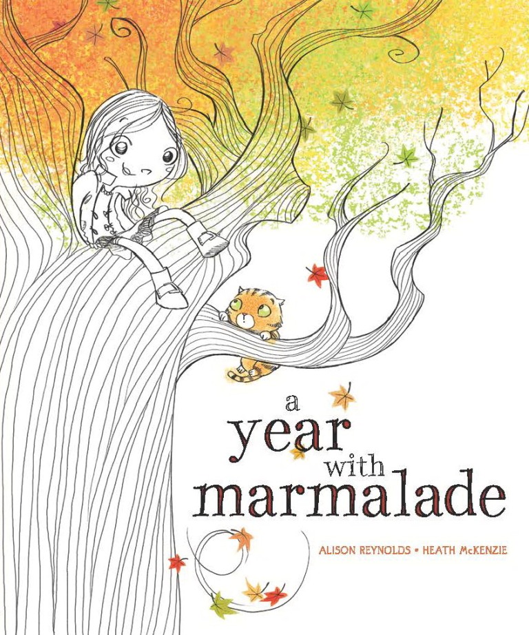
It’s a big welcome today to author Alison Reynolds and illustrator Heath McKenzie as they blog tour with their new book, ‘A Year with Marmalade’, published by The Five Mile Press – and to offer you a chance to win a copy.


It’s a lovely story of losing friends, making new ones and coping with change – and delightfully illustrated and airily designed with lots of delicious white space. Maddy goes away for a year and asks her friend Ella to look after her cat, Marmalade. But Ella’s and Marmalade’s ideas for enjoyment are different. As the seasons pass... – I won’t give any more away.

I love it, but what age range is it really aimed at?

Alison: Thanks for inviting us Peter. Pre-school/early school years – children 2 – 10 years old.

Everyone will adore it, and I can also imagine that it will be very popular in schools to help teach about the seasons.

I know it will have changed somewhat from conception to publication. Who came up with the brilliant idea for raised and embossed lettering on the cover and the tactile, almost sculpted, tree, and at what stage was the decision made?

Heath: This was purely an in-house design idea – and a very good one at that! (At least as far as I’m aware – I’d happily take credit but alas, it wasn’t my brainwave!)

It’s always a joy to work with publishers and their design and production people who go that little bit further to produce books of outstanding quality that will be forever treasured.

I’ve shown my copy to several friends and they all kept feeling the cover. It really does set the scene so well. And the creative typography is an important element throughout the book, too - graphically depicting stomping, falling leaves and much much more. It adds an extra dimension. Did you envisage all that from the start, Heath? Were the word and line shapes pencilled in detail on your initial storyboard?

Heath: Unlike a lot of other projects I’ve worked on, the text placement was designed before I began illustrating. Or more specifically, I’d done a sample spread (the first autumn leaves image with all the piles on the ground) so as to give everyone a good idea as to the style I intended to work with – from there this look was used to design text placement which I then worked with when creating the remaining images. At times my vision and their’s didn’t quite mesh so I’d suggest the odd change or two, but on the whole I did my best to maintain what had been designed.

Did you make any suggestions for word changes so that you could add particular design features? Was there any collaboration between you and Alison? Did you receive any useful suggestions from your art director?

Heath: I made no word changes and only became in contact with Alison after all was done! So on the whole, aside form the text design influences – I was free to carry on as I pleased! Of course, then some editorial discussion takes place and little tweaks are made, but on the whole, things generally remained intact from the initial roughs through to final art.

Do you start off with a pencil, ball-point, Wacom Tablet...?

Heath: I start off with a Wacom tablet and end the same way! From pencil roughs to final art – all digital but all most certainly as traditionally freehand-drawn as possible.

I know you’ve illustrated a significant number of books and are highly skilled at portraying children, but do you ever get children to perform particular actions for you to draw realistically?

Heath: Not yet! Though having just had a daughter – as she grows up, she may become a model more often than she might like! On the odd occasion, I’ve asked my wife for assistance, but that’s been for hand modelling, getting a particular hand pose right that I can’t model myself. Otherwise, my model is a Spider-Man action figure – he has an abundance of articulation points (right down to each finger) and has come in handy many many times!

Are the characters based on any people you know?

Heath: In this book, Ella bares a bit more than a passing resemblance to my niece.

Alison: I grew up with two neighbours/best friends and we played together every minute we could. I tried to imagine what it would have felt like if one of them moved. Marmalade is based on my very special green-eyed cat, Charlotte, who I had when I was little. I wanted to explore how even though things can change we can adapt and things will be even better.

My first pet was a ginger cat - Tom. As soon as we went out for the day or on holiday, he automatically and immediately went next door to get fed along with their cat, but normally never visited.

Can you share a page from the inside with readers, too – and websites people should visit for more information?

Heath: For more information about me, visit:

www.heathmck.com

It’s in need of an update but does the trick nevertheless!

As for a page from the book, instead I’d like to share a rare behind the scenes moment! For every book, I generally begin with designing the characters (very important!). Sometimes it all just comes naturally and easily, sometimes it’s a bit of a struggle to get the look I want right. As can be seen here, Poppy and Ella came quite easily and naturally – Marmalade on the other hand, took a bit of mucking about before I had something I was happy with. (Note also name changes – as I worked on the book, little bits and pieces changed around me along the way, character names being one thing!).


Wow – that’s even more of a treat. Thank you so much for letting us see those, Heath, and for telling us about the process of your book’s creation and development. I’m sure it’s going to be highly successful worldwide. Congratulations to you both and to all the team at The Five Mile Press!

Thanks Peter. It’s been fun!

Congratulations on the birth of your daughter, too, Heath - and to your wife.

And ‘A Year with Marmalade’ is available right now – ISBN 978-1-74248-880-6
RRP:  $14.95.

Alison’s website is full of wonderful things to discover:

www.alisonreynolds.com.au

...including a competition with a chance to win a signed copy – and a copy of the picture book ‘Lighty Faust the Lion’ (a much bigger cat), too.

I hope I'm right in saying that readers need to share their favourite photo that shows their cat’s personality.

Upload it to Alison’s Facebook page at

https://www.facebook.com/alison.reynolds.524

or email it to her as a low res jpeg file at alrey@msn.com.au and she’ll upload it on her website. www.alisonreynolds.com.au

Entries close on the 1st of September.

If you wish to gain some tips and learn more about the writing, illustrating and publishing process of this book, you may like to visit other stop off places on Alison’s and Heath’ blog tour.

Please add a comment or question here, too, if you you wish.

Peter Taylor
Writing for Children
www.writing-for-children.com

'A Year with Marmalade' Blog Tour

7th August Dee White

http://deescribewriting.wordpress.com

9th August Karen Tyrrell

http://www.karentyrrell.com/tag/karens-blog

11th August Tania McCartney

http://www.kids-bookreview.com

13th August Pass It On

http://jackiehoskingpio.wordpress.com/school-magazine
14th August Kathryn Apel

http://katswhiskers.wordpress.com/blog

17th August Dale Harcombe

http://orangedale.livejournal.com

20th August Peter Taylor

http://writing-for-children.blogspot.com.au

22nd August Susan Stephenson

http://www.thebookchook.com

23rd August Robyn Opie Parnell

http://robynopie.blogspot.com.au

27th August Sally Odgers

http://spinningpearls.blogspot.com.au

29th August Angela Sunde

http://angelasunde.blogspot.com.au

31st August Chris Bell

http://christinemareebell.wordpress.com


Sunday, April 08, 2012

Printing with a Gestetner - My First Book

Too many everyday tasks don't get described, and it's easy to forget how things were done only a few years ago. Well, 40 years ago. What details will people want to read in our work in 40 years from now?

When I first started teaching in schools in 1970, all school reports had to be handwritten with a fountain pen - no ball-points allowed. And no Liquid Paper. However, if an error was made, you could often get away with it by using 'correction fluid'. This consisted of a 'bleach' and a neutraliser in separate bottles. You dabbed on the solutions with applicator brushes. The trouble was, if you used too much of one of them, the paper dissolved, forming a hole. You then had to go around all other staff, confess, and ask each person who had written on the original copy to fill in a new one. Some colleagues smiled and obliged, while others were grumpy.

At the end of the term, it was also necessary to enter all subject marks on to a large master spread sheet (piece of paper) for each year group of about 120 students. Again, no corrections were allowed. This time, if you did have a lapse in concentration, you had to copy out the full sheet again with every child's name and their marks and position in class for every subject, as well as your own. There was therefore a rush to fill your own records on to the sheet before other staff entered theirs, for there'd be less to copy if you made an error. Stress, stress...

The worst thing was using a Gestetner machine for printing exam papers and worksheets. This used very permanent ?oil-based back ink. Gestetner 'skins' or stencils consisted of a waxed layer of mulberry paper on a thin cardboard backing to help typing. (You first had to remove the ribbon from the typewriter, and as you pregressed, the small hollows in e's and similar letters filled with wax, so you had to keep scrubbing them clean with a stiff brush). If you typed with too much pressure, you completely cut letters or bowls of p's and d's out of the master sheet, so when it was used for printing, the result was a series of black blobs. At the end of creating the stencil, you had produced 'perforated' letters through which the ink would be squeezed. This master was wrapped around a drum on the printer. If you were skilled/lucky you could prime the ink and print without too much trouble - but then you had to remove the inky master from the drum. If you were very fortunate, you could throw it away and avoid ruining all the clothes you were wearing - but if you wanted to keep the master for further use, you could attempt to reattach it to the backing by means of the ink layer. Doing this, transporting the sheets and storing them, and later sifting through your collection, opening them up and reattaching them to the machine, all while keeping yourself clean, was close to impossible.

Photos could be drum scanned on to the master by another machine - one that produced a spark which presumably melted the wax. The printed image was never of the quality you hoped for.

If you wanted to draw or handwrite on the stencil, you had to use a stylus or tool with a small spiked wheel at the tip - tricky, and no result from that prodedure was ever perfect, either.

Ah, the bad old days!

But the ability to print multiple copies cheaply was the catalyst for me to write books. I loved writing and creating information booklets for student use. The school managed a small nature reserve, and my first book was a guide to the distinguising features of the plants that could be found there, and their folklore. It was produced for visitors to the reserve, but was later published by the Hertfordshire and Middlesex Trust for Nature Conservation (1978):


The text was typed with an Olivetti Lettra 32 portable typewriter, the pen and ink drawings for the illustrations glued on and then the printing master created directly from these  ... I love my computer, scanner and laser printer!

Peter Taylor
http://www.writing-for-children.com/

Tuesday, February 07, 2012

Dickens' Desk and more

Charles Dickens was born on February 7th, 1812, so on this bi-centenary I have looked through my collection for something appropriate for you. Here’s an engraving of his desk, which I have scanned from ‘Harper's Weekly’, published in New York on January 7th, 1871. He always had to have particular items for his eyes to linger upon while he took brief rests from putting quill to paper. Any of these objects would have been instantly missed if it had been removed. On the left hand corner  you can see there was a French bronze of two rather fat sword fighting toads:

I have read that others included a bronze of a dog-fancier, with little dogs under his arms and in his pockets; a long gilt leaf and a rabbit sitting on its haunches; a huge paperknife which he often held in his hand while giving readings, and a green cup, decorated with cowslips, that was always filled with fresh flowers each morning before he started to write. Wherever he worked, his calendar was always set to the correct day and date and placed in front of him.


Is there anything on your desk that you ‘must have in place’ before you start writing, or do you have a set routine? My grandfather was a farmer and as soon as he stepped outside the house in the morning he picked a fresh flower from the garden for his button-hole. I'm more casual.

Of interest to illustrators may be the character sketches that Phiz (Hablot Knight Browne) did in the development of Mr Dombey. This is taken from ‘Phiz – A Memoir’ written by Fred Kitton in 1882:


Dickens’ works were often first released in serial form. The Tale of Two Cities was published in ‘All The Year Round’ without illustrations, but also available in monthly parts with Phiz’s illustrations from Chapman and Hall.


In America it was serialised in 'Harper’s Weekly', with illustrations printed from woodblocks engraved by John McLenan. My copy of May 21, 1859 says the story was ‘Printed from early proof sheets for which Messers. Harper and Brothers pay the author FIVE THOUSAND DOLLARS’. Big money in those days!


And I love the old advertisements in the magazines, too:

Enjoy!
 
Peter Taylor
http://www.writing-for-children.com/

Sunday, February 05, 2012

1880’s Print Run

Randolph Caldecott not only illustrated songs and poems, such as ‘John Gilpin’s Ride’ and ‘Come Lasses and Lads’, but also provided cartoons for ‘Punch Almanack’, works for ‘The Graphic’ magazine and illustrations for books by other authors - travel books and stories. He illustrated 3 books written by Julia Horatia Ewing:

 ‘Jackanapes’ in 1883

‘Daddy Darwin’s Dovecot’ in 1884


‘Lob Lie-by-the-Fire’ in 1885
  The advertising on the back cover of ‘Daddy Darwin’s Dovecot’ gives printed copies of ‘Jackanapes’ as ‘Thirty-fourth Thousand’ and on the back of Lob Lie-by-the-Fire as ‘60th Thousand’ with Daddy Darwin’s Dovecott as ‘40th Thousand’. They sure were popular!

I’m very curious to discover how many copies were printed in an average first print run of a children’s book in these times. One has to remember, however, that many English colonies did not have well established publishers of children’s books, so a large quantity would have been exported (less than 50 children’s books were published in Australia before 1890), and America was also a ready market. These books were published in London by the Society for Promoting Christian Knowledge and E. And J.B.Young and Co in New York, but were all engraved and printed by Edmund Evans in London.

I always love drawings which are used for, or incorporate, capitals to start chapters, as Caldecott provided in ‘Daddy Darwin’s Dovecot’:


Here's the Frontispiece from ‘Daddy Darwin’s Dovecot’:


and an illustration from ‘Lob Lie-by-the-Fire’:


Don’t you love the rich ink colour on off-white paper?

You'll find more images of elderly books on my Writing for Children website in the History of Books section, and I've also provided some pictures and an account of the work of Sir John Tenniel - illustrator of 'Alice in Wonderland' and Punch www.writing-for-children.com/Tenniel.

Peter Taylor
http://www.writing-for-children.com/